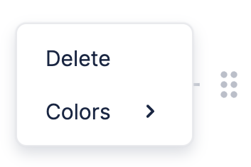
Block Side Menu
The Block Side Menu appears whenever you hover over a block, and is used to drag & drop the block as well as add new ones below it.

You can also click the drag handle in the Block Side Menu (⠿) to open the Drag Handle Menu.

Custom Drag Handle Menu
If you want to change the items in the Drag Handle Menu, or replace it altogether, you can do that using a React component.
You can see how this is done in the example below, which has a custom Drag Handle Menu with two items. The first one deletes the selected block, while the second opens an alert.
CustomDragHandleMenu is the component we use to replace the default Drag Handle Menu. You can see it's made up of a bunch of other components that are exported by BlockNote. Read on to Components to find out more about these.
After creating CustomDragHandleMenu, we tell BlockNote to use it inside BlockNoteView. Changing UI Elements has more information about how this is done.
Components
It might seem daunting to create your own Formatting Toolbar from scratch, which is why BlockNote provides React components that you can use which match the default styling.
Default Components
BlockNote exports all components used to create the default layout - both the menu itself and the items in it. Head to the default Drag Handle Menu's source code to see all the components that you can use.
Custom Components
BlockNote also provides components that you can use to make your own menu items, which also match the default styling:
// Takes same props as `button` elements, e.g. onClick.
export const DragHandleMenuItem = (props) => ...;
